 |
TheoWorlds Builder SDK v2 Documentation |
Map Graphics
1. Map graphics layers
![]() TIE is tile-based engine - it means that the map is divided in square tiles on which objects are placed, pretty much like a chess board. In an isometric view, because of the 45° view angle, those tiles are projected as rhombuses squeezed vertically by half - every tile is twice as wide as tall.
TIE is tile-based engine - it means that the map is divided in square tiles on which objects are placed, pretty much like a chess board. In an isometric view, because of the 45° view angle, those tiles are projected as rhombuses squeezed vertically by half - every tile is twice as wide as tall.
 |
The TIE view angle can not be modified, but the tiles size can be easily changed. The demos that come with this SDK use 44x22 px tiles. Note that though the characters can move just from one tile to another and can not stop in between, the graphics doesn't have to fit precisely inside tiles borders. The tiles grid is for your reference and will not be visible on the map. The TWB maps are assembled using 5 layers of graphics: background image, floor tiles, furniture objects, characters and foreground image. 1. Background - this is an optional image that can be used as a map background. It will be placed beneath all the other map layers. It is used mostly to draw terrain images without the need to cover it all with multiple floor tiles and also to draw the object that are "behind" the map - like the cityscape, the sky, etc. Here is a good example of a map background. Note that objects such as furniture can be also included in the background as long as the area behind them is non-walkable - like the fence on this map on the far edge - the characters and other objects can not be placed behind it. 2. Floor or ground tiles - those are map objects that are placed on a layer above the background image and below other map objects (furniture and characters). Those tiles are usually used to cover the map floor/ground with textures (ground, sand, stone, grass, carpet, etc....).
3. Furniture - those are the objects placed on the map, around which characters can walk or interact with (like sitting on a chair, or picking up a bonus object). The different between floor tiles and furniture is that characters and furniture share the same z-order space - it means that the furniture in front of a character will cover him/her and vice versa, creating a 3D space with object between which a character can walk. That's why unlike the floor tiles objects that are usually flat or low (like grass), the furniture usually has height (ex: benches, tables, trees, fences...).
4. Characters - those are the avatars that are moving around the map (usually walking, but not necessarily).
5. Foreground - this is a top layer that contains an image that can be placed on top of the map, covering all other layers. It is used mostly to add some decoration elements, like branches, map frames, etc. In this example a foreground layer is used for the disco lights and the frame holding them, since no other object can be placed in front of it. All those five layers together create the map. Combining a finite set of map graphics like floor tiles and furniture an infinite number of maps can be created. The Map Editor is used to assemble together the maps from different graphics. Below is more information about drawing each type of graphics. To read about how to add or modify the graphics in TheoWorlds Builder click here (coming soon). |
2. Map format and size
 TIE maps are rectangular, composed of X rows and Y columns. Each tile has an unique (row:column) coordinate, starting with top left corner (0:0). Because of the isometric view, the tiles that belong to the same row are placed in a zigzag line (see the gray tiles on the left image). The blue tile on the image has the coordinates (4:5).
You don't have to use every single tile and cover it with graphics - you can create even round maps by fitting them inside the rectangular map space and not using the corner tiles.
TIE support maps of any size. The map size and it's visible area can be changed easily. If the map is bigger then the visible area, it will auto-scroll as the character approaches the edge.
3. Graphics format
Flash supports both vector and bitmap graphics.
![]() All the map graphics is stored in external SWF files, except map foreground or background (those can be in GIF, JPG and PNG as well.
All the map graphics is stored in external SWF files, except map foreground or background (those can be in GIF, JPG and PNG as well.
You can place inside those SWF files images in different formats supported by Flash, including:
- GIF - small size, good for pixel graphics with limited number of colors. It also supports transparency.
- JPG - small size, better with images containing lots of colors. Doesn't support transparency so it can be used mainly for background and foreground
- PNG - bigger size, high quality. Supports transparency and semi-transparency
Check Flash documentation to see all the supported formats. You can also draw directly in Flash using its vector editing tools.
The SWF files servers as a "wrapper" for your images and its main reason is to place your images so they fit right into the tiles. But it also can do these additional functions:
- extra compression (smaller file size) - works the best with PNG, since those are low compression files
- combining multiple images in one single container
- adding animation
You can create the graphics in any image editing software or directly in Flash, but at the end it has to be exported in SWF.
4. Drawing backgrounds
- Remember that those are usually large images. Make sure you optimize their size at the end.
- You don't have to use backgrounds and can just use floor tiles to cover the map. The best results and flexibility is achieved when combining those two methods, using backgrounds for extensive areas and floor tiles for additional elements.
5. Drawing floor tiles
You can also take advantage of the fact that the floor tiles can be layered on top of each other. This gives a greater flexibility and creates more options from the same set of graphics. For example, instead of drawing different floor tiles of grass: plain grass, grass with yellow flowers, grass with white flowers, etc., you can just create a separate grass tile and separate tiles for different flowers, then you can place those flowers on top of grass in different combinations or even place them on other types on tiles: sand, rocky terrain, etc.
6. Drawing furniture
As with floor tiles you can avoid "blockiness". You can also stack furniture on top of each other, same as with the floor tiles, but also taking in consideration it's height. Example: you can have a vase image that can be placed either on a ground or on a table.
The size of furniture images is limited to 3x3 tiles and there are some configurations that don't work (see below), but you can create furniture that connects like LEGO pieces into large blocks. Check the example below for a set of different furniture tiles on the left and an example of assembling them together on the right:
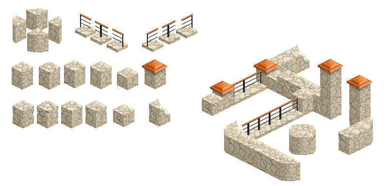
Characters can interact with furniture and, as an example of such interaction, we implemented the seatable furniture - you can draw chairs, benches, etc. Note that the characters that come with current SDK can sit facing forward only.
Multi-tile furniture configurations
You can create various furniture configurations using up to 3x3 tiles, though some configurations will contain "trouble" tiles - the ones where the z-order will not work as expected (objects will not cover each other in the right way). There are ways to go around this (see below).
Below are listed the majority of the combinations you will get into. These are the symbols used:
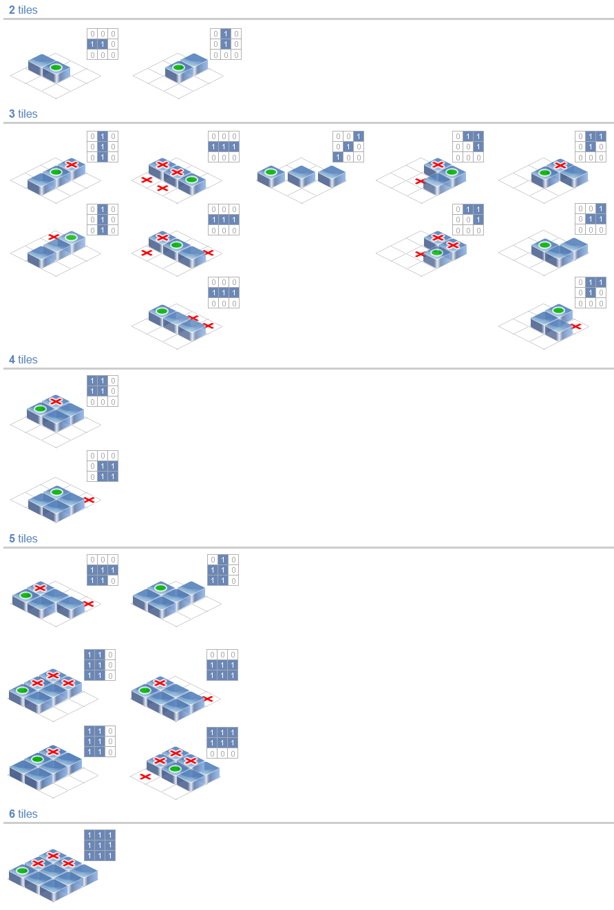
![]() You can move around the "trouble" tiles by changing the furniture registration tile. To avoid any z-order problems on the map, avoid placing objects on the "trouble" tiles. Make them non-walkable, non-sittable and place a background wall in that spot, etc.
You can move around the "trouble" tiles by changing the furniture registration tile. To avoid any z-order problems on the map, avoid placing objects on the "trouble" tiles. Make them non-walkable, non-sittable and place a background wall in that spot, etc.
7. Drawing characters
 Characters are the most complex graphic elements on the map, mainly because of the animation. Our SDK comes with a man and woman characters that can: walk in 8 directions, change clothes, dance and sit.
The walking animation is assembled from a set of images representing characters in different stages of a step, called "phases": a character raises one foot, moves it forward, steps on it, pulls the second foot, etc. More phases means a smoother animation, but also increases the number of images that have to be created. This is very important when also having the clothes layers on top of characters, since those will have to be animated as well.
![]() Note that you don't have to animate the characters in all 8 directions, but can just "mirror" the animation in opposite directions (ex: you can create the animation for walking to the right by simply flipping the images of the animation for walking to the left).
Note that you don't have to animate the characters in all 8 directions, but can just "mirror" the animation in opposite directions (ex: you can create the animation for walking to the right by simply flipping the images of the animation for walking to the left).
 TIE allows you to use different number of phases for walking animation and even to modify its speed. Characters that come with this SDK use three phases for walking animation plus one for a standing position (3+1). When a character starts walking, it switches from phase 0 (standing) to phase 1, then 2, then 3 (and so on if you have more phases). With each switch, the character is moved on the map by a certain amount, so by the time it reaches the last phase, it's already placed on the next map tile. At this point the character either stops (phase 0), or keeps moving by switching back to phase 1, then 2, then 3, repeating each cycle for each tile.
Besides the walking animation you can have different poses for characters - we included the sitting one as an example, or even custom actions - we included the dancing animation as an example. Same rules apply here as to the walking animation: more phases means more images, including the clothes, but you can "mirror" almost half of it.
![]() Note that you can create characters that don't have walking animation (basically using one single animation phase, or just copying the same phase multiple times) - for example you can have ghosts that just float around.
Note that you can create characters that don't have walking animation (basically using one single animation phase, or just copying the same phase multiple times) - for example you can have ghosts that just float around.
TIE characters include layers like clothes and accessories. We included a bunch of such layers into the characters that come with our SDK. Using different options for each layer (like different tops, or different haircuts) those can be combined to create a wide range of customized characters.
 When drawing a character with clothes/accessories layers, we start with the body, animate it in all directions and only after that we proceed with creating the other layers. We recommend following the same order in order to avoid re-doing some work later.
In order to be able to mirror the character animation (big time/effort saver) in 3 of the 8 directions, make sure that you draw symmetrical characters - one side should be exactly the same as another. Same applies to clothes. If you would add, for example, a badge on the right side of the chest, it will end up on the left side when the animation is flipped to mirror it.
When drawing the clothes, start with creating them for the standing character (phase 0):

 After creating the layers for a standing character you can create them for all the other characters poses and animations (walking, dancing). More layers/accessories you have - more images you will have to create. Some clothes/accessories layers are easier to draw than others. For example, the sunglasses just have to be moved around to follow the movement of the head.
8. Drawing foregrounds
9. Using elevations
 TIE supports terrain elevations. It means that you can elevate different tiles to a different height in order to create hills, staircases, etc.
In order to create the elevations, the tiles are elevated in Map Editor. Once it's done, all the floor tiles, furniture tiles or characters placed on the top of those tiles will also be elevated. The characters that walk between tiles with different elevations will automatically adjust their vertical positions. Avoid creating dramatic elevation changes for the walkable areas, since the default characters don't have a stepping animation and it will become more obvious.
The easiest ways to create maps with large elevated areas is to use a background image and then just adjust the tiles position to create the landscape that fits the image.
10. Using animation
11. Creating better graphics
Some ideas and suggestions that may help you create better map graphics:
- Notice that introducing small variations of the same furniture or floor tiles (ex: like stone blocks with cracks) gives the possibility to assemble together more realistic maps, without too many uniform repeating elements.
- To build arches through which the characters can walk through, you will have to split them in two separate sides - the back and the front one.
- You can use semi-transparency to blend in graphic elements and avoid pixilated edges. PNG is the only format that supports pixels with different levels of alpha-transparency. (ex: an image of a puddle with its edges blending into transparency can be placed on any ground surface).
12. Putting it all together
Below are examples of how you can assemble together complex maps using a limited set of library objects.
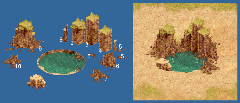
Example of assembling complex landscape elements combining a limited set of objects - different variations can be made combining the same objects.
Animated bubbles can be added on the top of the pond, for a cool effect.
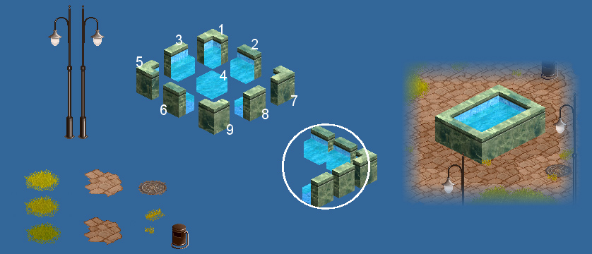
Example of assembling together a concrete pool.
Using just 8 furniture pieces, a rectangular pool of any size can be assembled.
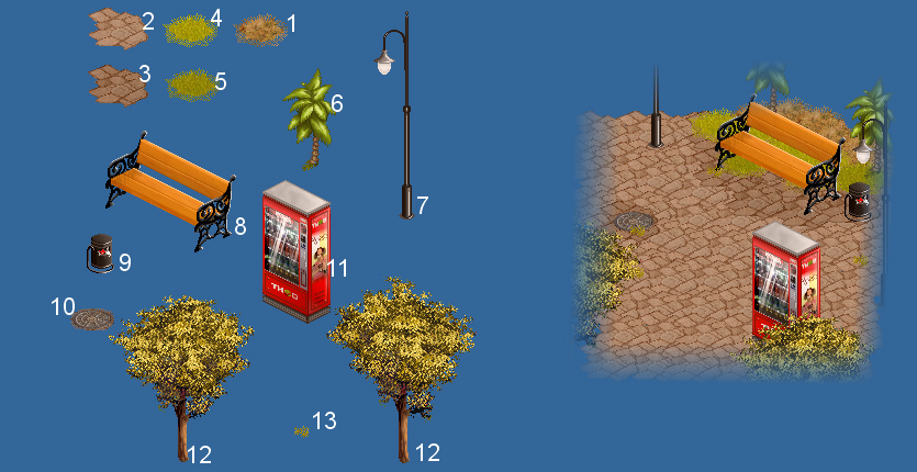
Here the darker stone patches on the ground on top of the lighter background texture are used to create shadows around objects (the bench, for example).
Shadow, in a right amount, can help adding "volume" to a scene.
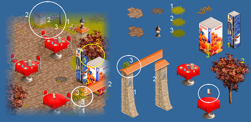
Example of a complex park scene assembled from a limited set of objects.
Start by planning your scenes on paper, then move to the Map Editor. And don't be afraid to experiment!